Table of Contents
- Understand Your Brand, Values, Industry, and Competition
- Know Your Audience for Effective Logo Design
- Utilise Negative Space and Empty Space in Logo Design
- Choose Typography Carefully for Readability and Impact
- Incorporate Iconic Elements for Memorable Logos
- Create Contrast and Visual Salience with Shapes and Lines
- Key Takeaways for Designing a Successful Logo
Designing Unforgettable Logos: 6 Key Logo Design Tips for Next-Level Branding
Did you know that a well-designed logo can make or break a brand? It’s true! Logo design plays a crucial role in enhancing brand recognition and credibility.
When customers see a captivating logo, it instantly creates a strong visual identity for businesses. Think about it – when you see the swoosh of Nike or the golden arches of McDonald’s, you immediately associate them with their respective brands.

But it doesn’t stop there. A professionally designed logo also sets the tone for brand messaging. It reflects the brand’s personality, story, and values.
And here’s the kicker – memorable logos contribute to increased customer loyalty. People are more likely to trust and connect with brands that have eye-catching logos.
So, if you’re looking to establish your brand name and stand out from the competition, investing in top-notch logo design is non-negotiable. Let’s dive into the fascinating world of logo design and discover how it can propel your brand towards success.
Understand Your Brand, Values, Industry, and Competition
To create a logo that truly represents your brand and sets you apart from the competition, it is crucial to have a deep understanding of your brand’s core values, industry trends, target audience preferences, and competitor logos.
Let’s delve into each aspect to help you design an effective logo.
Research Your Brand’s Core Values
Your logo should be a visual representation of your brand’s identity and values. Before diving into the design process, take some time to research and define your brand’s core values. What does your business stand for? What message do you want to convey to your customers?
Consider the following steps:
- Identify the essence of your business: Think about what makes your company unique and what sets it apart from others in the market.
- Define your target audience: Understand who your customers are and what they value in order to create a logo that resonates with them.
- Brainstorm keywords: Come up with a list of words that reflect the personality and character of your brand.
- Visualize concepts: Use mood boards or sketches to explore different design directions based on these keywords.
Analyze Industry Trends
Staying up-to-date with industry trends is essential when designing a logo that stands out in a crowded market. You want your logo to be contemporary while maintaining its longevity over time.
Consider these points:
- Explore current design styles: Look at logos from successful companies within your industry or related fields for inspiration.
- Consider colour psychology: Different colours evoke different emotions and can communicate specific messages about your brand.
- Keep it simple: Minimalistic designs are often more versatile and memorable than complex ones.
- Think beyond aesthetics: Consider how technological advancements or cultural shifts may impact future logo designs. For instance, the advancement of AI technology has revolutionised the logo design industry.
If you’re unsure of the latest trends in logo design, always remember to check out articles or videos published by well-known design companies.
Identify Target Audience Preferences
Understanding the preferences and expectations of your target audience is vital when creating an effective logo that resonates with them. Your logo should appeal to their tastes and align with their expectations.
Consider these strategies:
- Conduct market research: Use surveys, focus groups, or social media polls to gather insights about what your target audience finds appealing in a logo.
- Analyze competitors: Look at the logos of other companies targeting a similar audience to identify common design elements that are well-received.
- Consider demographics: Age, gender, location, and cultural background can influence design preferences.
Study Competitor Logos
To differentiate your brand from competitors, it’s essential to study their logos and identify opportunities for uniqueness. By understanding what your competitors are doing, you can position your brand more effectively.
Consider these steps:
- Analyze competitor logos: Look at the logos of other companies in your industry or niche. Take note of the design elements they use and how they communicate their brand values.
- Identify gaps: Look for areas where your competitors’ logos may be lacking or not effectively representing their business message.
- Differentiate strategically: Use this knowledge to create a logo that fills those gaps and positions your brand uniquely in the market.
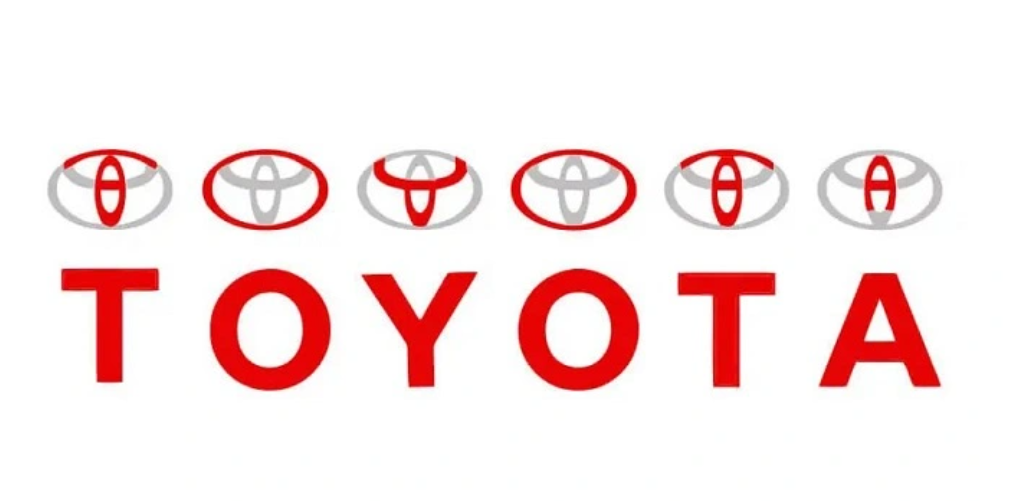
By thoroughly researching your brand’s core values, analyzing industry trends, understanding target audience preferences, and studying competitor logos, you will be equipped with valuable insights to design an exceptional logo that captures the essence of your business while standing out from the competition.
Know Your Audience for Effective Logo Design
Understanding your target audience is a prerequisite to creating a logo that resonates with them and effectively communicates your message.
Tailoring the colour palette and style of your logo to match the taste of your target audience is essential. Graphic designers should consider the age group, gender, and cultural background of their intended viewers.
For example, if you are targeting younger demographic, vibrant colours and modern designs may be more appealing. On the other hand, if your audience consists mainly of professionals or an older generation, a more sophisticated and timeless approach might be suitable.
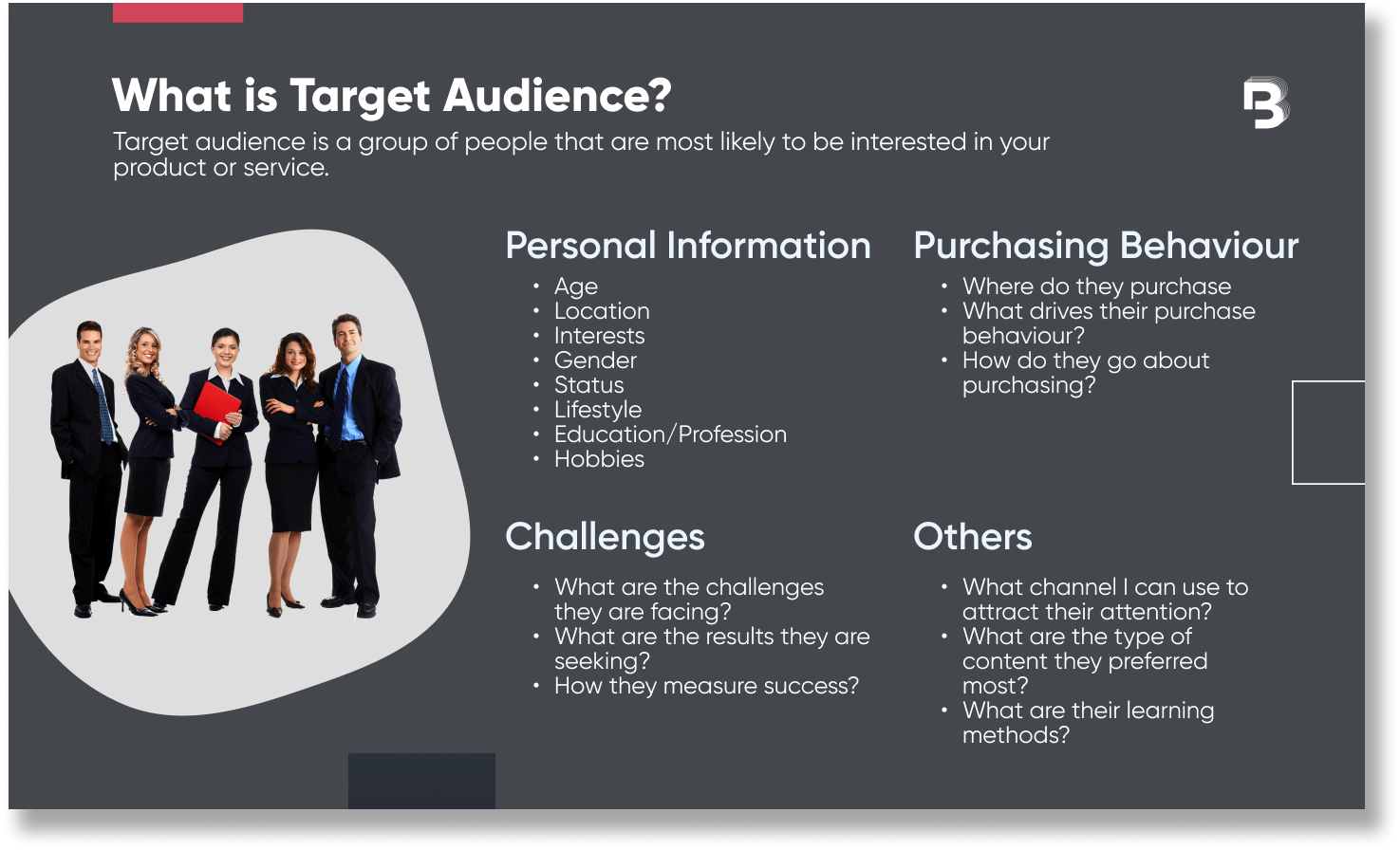
It’s important to ensure that your logo not only captures attention but also conveys its intended meaning to the viewer. The design should align with the values and goals of your target market.
By conducting focus groups or surveys, you can gather feedback from potential customers or clients about different logo variations. This feedback will help you refine your design choices and create a logo that effectively communicates with its intended audience.
In today’s digital age, social media plays a significant role in reaching out to people. Therefore, it’s crucial to consider how your logo will appear on various online platforms such as Facebook, Instagram, Twitter, and LinkedIn.
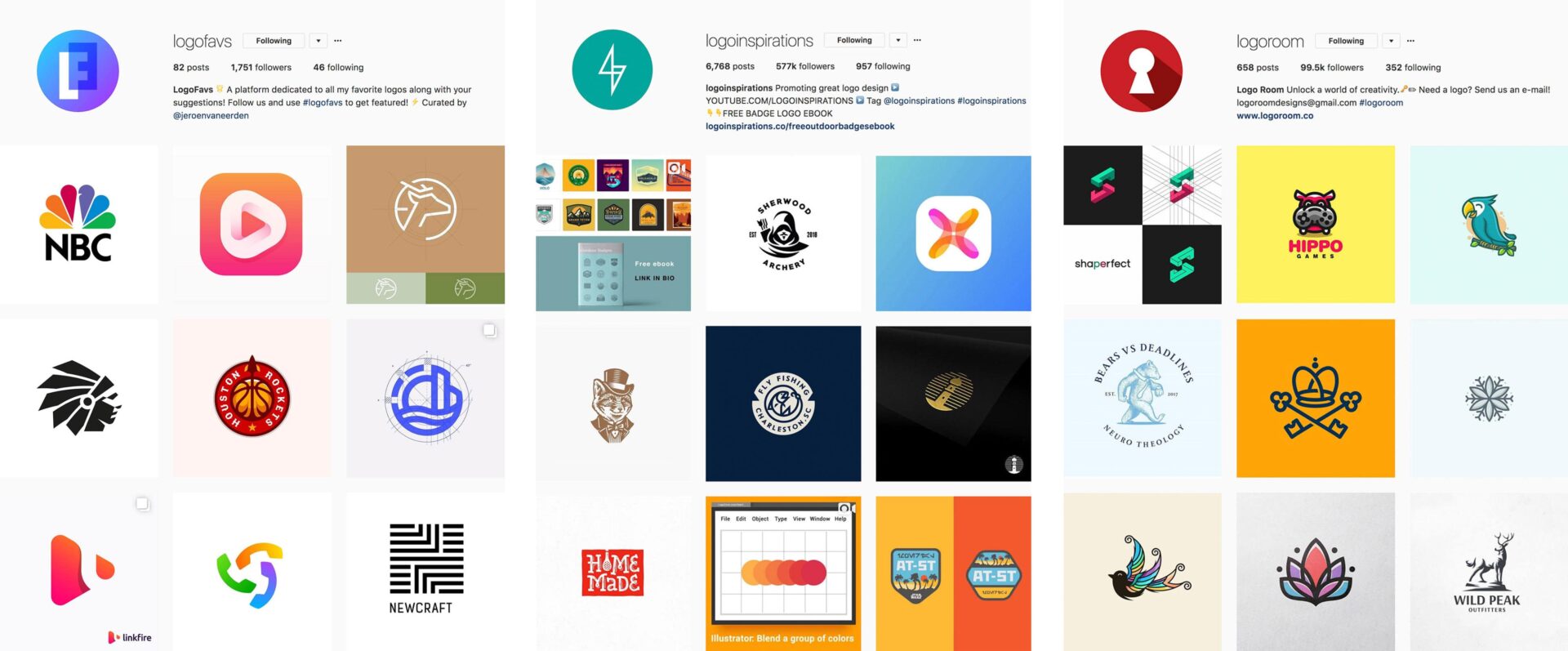
Remember that logos displayed on smaller screens like mobile devices should still be easily recognizable and legible.
Understanding your target audience goes beyond knowing their basic demographics; it involves grasping their desires and aspirations as well. A good designer knows how to tap into these emotions through the clever use of symbolism or imagery in their logos.
Moreover, gathering feedback from focus groups lets you understand how people perceive your logo at first glance. This insight enables you to make any necessary adjustments before unveiling it to the public.
Remember, your logo is not just a visual representation; it should effectively convey your brand’s values and message.
Utilise Negative Space and Empty Space in Logo Design
Clever use of negative space can create hidden meanings or additional elements within a logo design. By strategically incorporating negative space, designers can add depth and intrigue to their logos.
For example, the FedEx logo uses negative space between the “E” and the “x” to form an arrow, symbolising speed and forward movement. This subtle addition adds a layer of meaning that resonates with viewers on a subconscious level.

Strategic placement of empty space enhances readability and clarity in a busy marketplace. In today’s visually cluttered world, it is crucial for logos to stand out and be easily recognisable. This creates a focal point for the viewer’s eye, allowing them to quickly identify the brand.
Negative space can make logos more versatile across various mediums and sizes. Logos need to be adaptable to different applications, such as print materials, websites, social media profiles, and even merchandise.
The strategic use of negative space allows logos to scale well without losing their impact or legibility. This versatility ensures that the logo remains effective regardless of its size or context.
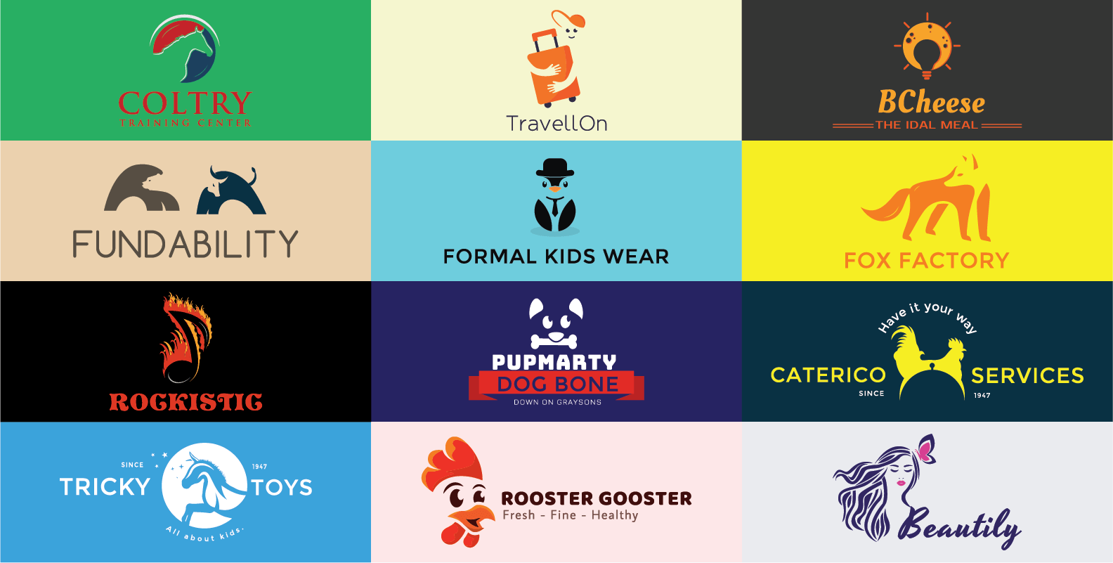
Minimalistic designs utilising negative space often appear modern and sophisticated. By embracing simplicity and using blank spaces intentionally, designers can create sleek and contemporary logos that resonate with audiences seeking clean aesthetics.
Companies like Apple have successfully employed this approach in their logo design, resulting in an iconic symbol recognised worldwide.
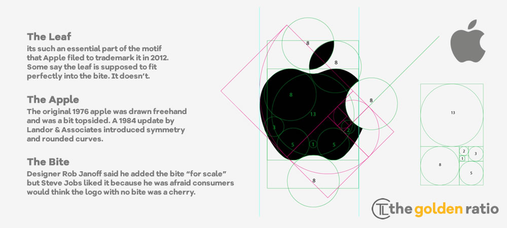
Incorporating negative space into logo design requires careful consideration of graphic design principles such as balance, harmony, and proportion.
Designers must strike a delicate balance between positive elements (the main shapes) and negative elements (the surrounding empty spaces) to achieve an impactful composition.
When working with negative space in logo design:
- Experiment with different arrangements of positive and negative elements.
- Use contrasting colours or shades to emphasise the separation between positive and negative spaces.
- Ensure that the negative space complements the overall message or concept of the logo.
- Test the logo in various sizes and applications to ensure its effectiveness across different mediums.
Choose Typography Carefully for Readability and Impact
Selecting the right typography is crucial. It not only reflects your brand’s personality but also plays a significant role in ensuring readability and making a lasting impact on your audience. Here are some essential tips to consider when choosing typography for your logo:
Reflect Your Brand’s Personality with Fonts
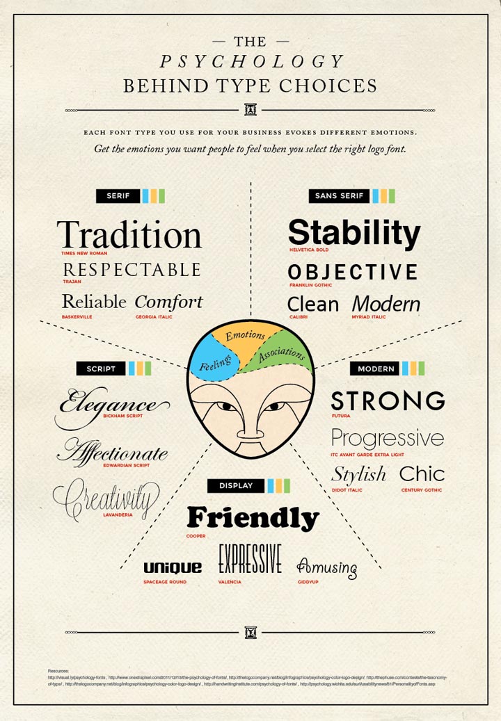
Typography should be chosen carefully to align with your brand’s personality. Whether you want your logo to convey elegance, playfulness, or professionalism, the right font can help communicate that message effectively.
Consider the emotions and values associated with your brand and select fonts that reflect those qualities.
To maintain readability across different sizes, opt for fonts that are clean and easy to read. Sans-serif fonts like Arial or Helvetica are popular choices as they offer simplicity and clarity. However, don’t limit yourself to just sans-serif options; serif fonts can also work well if chosen wisely.
Complement Other Design Elements
While typography is an important aspect of a logo, it should not overpower other design elements.
The goal is to create a harmonious balance where all components work together seamlessly. Avoid using overly decorative or elaborate fonts that may distract from the overall design.
Experimenting with custom lettering or modifications can add uniqueness to your typographic treatment. Customizing letters or creating hand-drawn elements allows you to tailor the typography specifically for your brand identity.
Ensure Legibility Across Platforms
In today’s digital age, it is crucial to consider legibility across various platforms such as websites, social media profiles, mobile apps, and print materials. Different devices and screen sizes may affect how fonts appear on screens.
To ensure legibility across platforms:
- Test different font sizes on various devices.
- Opt for lowercase letters as they tend to be more readable than uppercase.
- Avoid using excessively thin strokes or condensed letterforms that might become illegible at smaller sizes.
- Pay attention to the spacing between letters and words, ensuring they are not too tight or too loose.
Customise Fonts for a Unique Look
While there are countless font options available, you may want to customise them further to achieve a truly unique look for your logo. Several tools and software allow you to modify existing fonts or create entirely new ones.
Consider these customisation options:
- Adjusting the weight or thickness of certain letters.
- Modifying letter shapes or adding stylistic elements.
- Combining different fonts to create a custom wordmark.
By customising typography, you can make your logo stand out from competitors while maintaining readability and impact.
Incorporate Iconic Elements for Memorable Logos
Incorporating iconic elements into your logo design can make it truly memorable and leave a lasting impression on your audience.
Here are some tips to help you create the perfect logo that incorporates iconic elements:
Balance Originality and Familiarity
When incorporating iconic elements into your logo design, it’s important to strike a balance between originality and familiarity.
While you want your logo to stand out, using familiar symbols or icons can help create an instant connection with your target audience.
A great example of using this principle is Microsoft’s logo. Noticed that they are integrating their products and core values into its logo design.
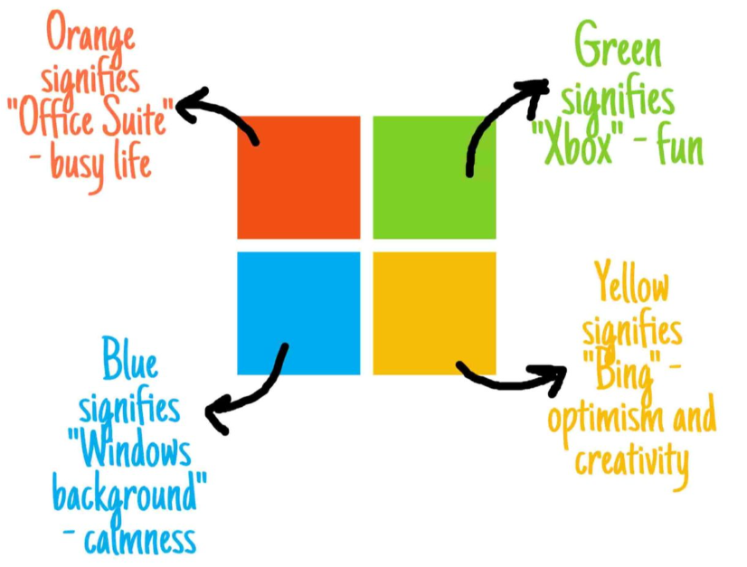
Image source
Choose Scalable and Recognizable Icons
It’s crucial to select icons or symbols that are not only visually appealing but also scalable and easily recognizable across different platforms and sizes.
Your logo should look great whether it’s displayed on a website, business card, or billboard. Take inspiration from successful logos like the Apple logo – simple yet instantly recognizable.
Align with the Branding Scheme
The incorporation of iconic elements should align seamlessly with your overall branding scheme. Consider how these elements complement your brand’s personality, values, and message.
If you have a tagline associated with your brand, think about ways to incorporate it alongside the icon or symbol cohesively.
Create Visual Appeal
Iconic elements can add visual appeal to your logo design by making it more engaging and memorable. They provide an opportunity to communicate complex ideas or concepts through simple images or symbols.
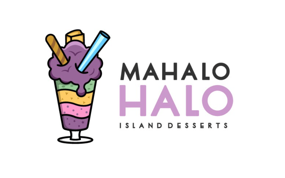
Check out this example of the logo from a dessert shop and notice how they incorporate a visual icon (i.e., ice cream milkshake) into its logo.
Stand Out from Competitors
While it’s important to consider industry-related icons or symbols, strive to create a logo that sets your brand apart from competitors.
Look for unique design elements that capture the essence of your brand while differentiating it from others in the market. A great logo should be able to make an impact and be easily distinguishable among similar logos.
One of the great examples of logos that stand out from their competitors is Neil Patel’s SEO tool Ubersuggest. Neil Patel wisely incorporates his own appearance in most of the marketing promotion of the tool which makes the brand more friendly compared to other brands.
Therefore, incorporating iconic elements into your logo design can elevate its overall impact and make it more memorable.
So, when designing your next logo, consider incorporating meaningful icons or symbols that capture the essence of what makes your brand unique and memorable.
Create Contrast and Visual Salience with Shapes and Lines
Utilising visual elements such as shapes and lines is crucial in logo design. These elements not only add aesthetic appeal but also help create contrast and visual salience, making your logo stand out from the competition.
Utilise Contrasting Shapes for Visual Interest
One of the key aspects of creating an eye-catching logo is utilising contrasting shapes.
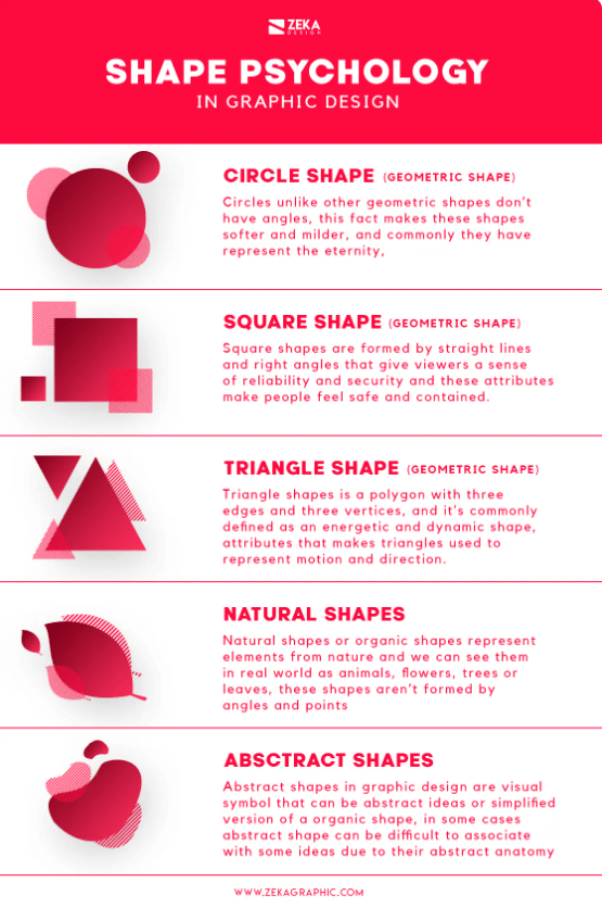
For example, consider juxtaposing geometric shapes with organic ones to achieve a balanced yet striking look. Geometric shapes often convey a modern, clean aesthetic, while organic shapes evoke a sense of nature or fluidity.
Two great examples that use geometric shapes in their logo are Spotify and Adidas.
Spotify uses rounded corners and curved lines to contribute to a gentle, approachable, and highly contemporary aesthetic, aligning seamlessly with the streaming service’s goal of appealing to a diverse range of viewers.

Adidas utilises the three stripes in their newer logo to symbolize the challenging journey that athletes undertake to achieve excellence in their pursuits. Geometric shapes often serve as subtle suggestions of broader concepts, allowing for symbolism without being overly explicit.

Experimenting with shape combinations can help you find the perfect balance that aligns with your brand’s identity. Sketch out different variations using contrasting shapes to determine which composition resonates best with your vision.
Play with Line Weights for Depth and Dimension
Lines are another powerful tool in logo design that can enhance depth and dimensionality. Varying line weights can create a sense of hierarchy within your logo, guiding the viewer’s focus towards specific elements.
Thicker lines can be used to emphasize important features or boundaries, while thinner lines can add intricacy or delicacy.
Consider how different line weights interact with each other and impact the overall composition. Experimentation is key here as well – try sketching multiple versions of your logo using varying line weights until you achieve the desired effect.
Incorporate the Psychological Impact of Shapes and Lines
Shapes and lines have psychological associations that can influence viewers’ perception of your brand. Understanding these associations lets you strategically communicate certain messages or emotions through your logo design.
For instance, symmetrical shapes often convey stability, balance, and harmony, making them suitable for brands that establish trustworthiness or professionalism.
On the other hand, asymmetrical shapes can evoke a sense of energy, excitement, and creativity, which may be more fitting for brands targeting a younger or more adventurous audience.
Consider the psychological impact you want your logo to have and choose shapes and lines accordingly. By aligning these visual elements with your brand’s personality, you can create a logo that resonates with your target audience on a deeper level.
Key Takeaways for Designing a Successful Logo
In conclusion, with these key logo design tips, you have the power to take your brand to new heights. Your logo is the visual ambassador of your business, so embrace the tips that we have shared in this article. Stay updated with the latest design trends, while daring to be unique.
Remember that designing a compelling logo takes practice and experimentation. Don’t be afraid to iterate on your designs until you achieve the desired outcome. Seek feedback from trusted sources or engage with professional designers who can provide valuable insights.
Now, it’s time to take action. Our skilled logo designers are here to help. With expertise and passion, we can bring your brand’s vision to life. Visit our logo design services page today to explore how we can collaborate and create a logo that captivates.
FAQs
Q: How important is it to understand my brand before designing a logo?
Understanding your brand is crucial as it forms the foundation for an effective logo design. It helps you communicate the essence of your business through visual elements.
Q: Why should I consider my audience when designing a logo?
Considering your audience ensures that the logo resonates with them emotionally while effectively communicating what they expect from your brand.
Q: How does negative space contribute to an impactful logo design?
Negative space allows for the creation of hidden meanings or clever visual elements, making your logo more memorable and engaging.
Q: Can typography impact the readability of a logo?
Typography plays a significant role in ensuring that your logo is easily readable, especially.
Q: Why should I incorporate iconic elements into my logo design?
Incorporating iconic elements helps create logos that are easily recognizable and memorable, enhancing brand recall among consumers.
Q: How can contrast and visual salience enhance a logo design?
Contrast and visual salience add visual interest and make your logo stand out. They help draw attention to specific elements within the design.
Q: What should I do if I need further assistance with logo design?
If you require additional guidance or expertise in logo design, consider reaching out to professional designers who can provide tailored advice based on your unique requirements.








Leave A Comment